Branded Content
Toblerone
Be More Triangle
The luxury chocolate world is all too serious–and square.
But Theodor Tobler dared to be different, creating the first Swiss chocolate bar cast in a shape that broke the mold.
With its edgy ‘awkward eat’ shape, Toblerone disrupted the stuffy, square world of Swiss chocolate—setting itself apart.
My Role
Lead Creative
Responsibilities
Art direction
Photo direction
Categories
Branded Content
Campaign
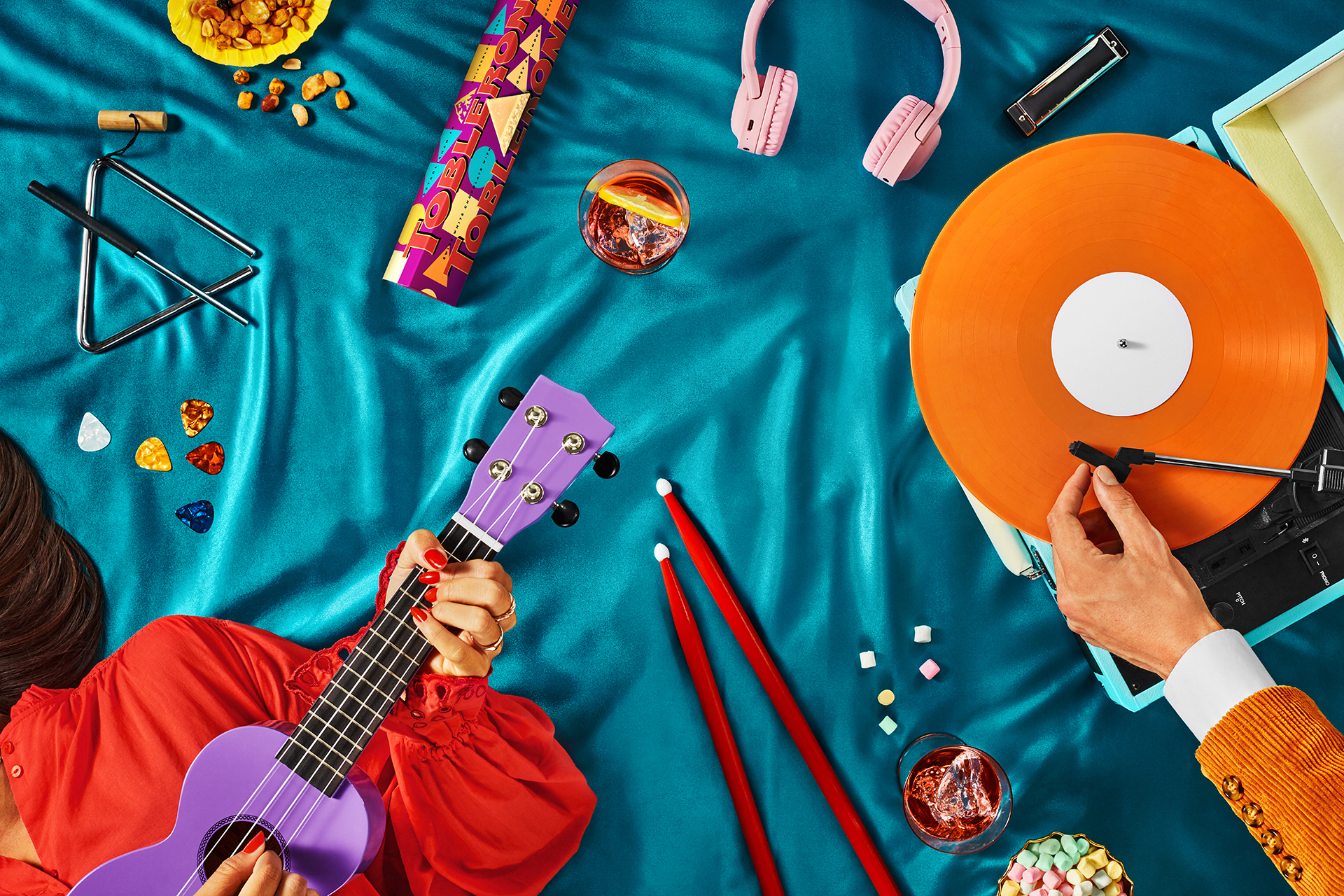
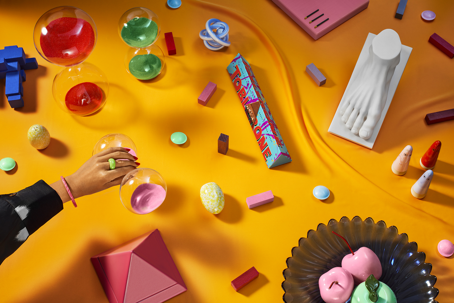
Alongside .monks' redesign of Toblerone.com, we reinvigorated the product imagery on the platform, establishing a new look and feel that shifted Toblerone from product-first to culture-first.
We brought Toblerone's Be More Triangle brand attitude to life through atmospheric, occasion and interest-based product environments.
To Be More Triangle is to be bold, brave, and playfully disruptive.


Credits
Lead Creative & Art Director
Miriam Patience
Creative Director
Nimo Awil
Adam Kammin
Music
Claudia Biondini